In my post yesterday, I showed some icons I made in Acorn and offered a download of the source file. Today I thought I could explain how two of the icons were made, since just looking at some pixels doesn't really show everything. I'm using Acorn 3.2 in this tutorial. See yesterday's post on how to grab version 3.2 if you'd like to follow along.
For the first example I'm going to use the pause icon. This is a relatively simple icon. Below you can see two views of it, one at actual size and one blown up to 800%. You can use the shortcut keys command-1 or command-4 to switch between the two zoom levels easily.
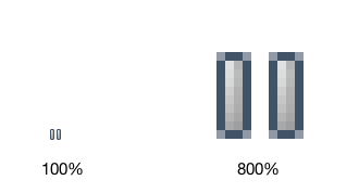
So what is really shown here? Well, first go ahead and chop off half the image since it's really just one element multiplied by two:
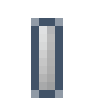
And then after that, what is left? It looks like 40 carefully placed pixels. But it's not. It's really just two vector shapes on a shape layer.
On the left there is a 1x8 rectangle, which has a gradient fill from white with 60% opacity, down to white with 0% opacity. The stroke is set to 0px. Also note that I've changed the background color since white on white turns out to not be very interesting.
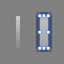
On the right is a 2x8 rectangle, which also has a gradient fill of 76% white down to 61% white. Both ends of the gradient are 100% opaque. Why 76% and 61%? No reason, it's just what I picked out when moving some sliders around. You'll also notice that it has a 1 pixel stroke of some sort of dark blueish green color. This color is used in Acorn's layers list selection highlight, in case you are curious.
And finally - what about the corners? How were those made? It's just a 1 pixel corner radius.

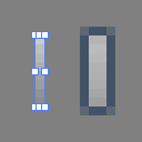
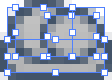
Acorn's shape palette for the second shape.
And that's it. Put the highlight on top of the pause icon, copy and paste it, and tada:

A total of four shape elements to make up the icon.
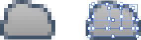
Ok, so picking the pause button is a bit easy. How about a more complex example, like the little cloud icon:

The cloud icon is a collection of 8 different shapes. Two round rectangles, four ovals, and two bezier paths. You could do it with just 3 complex bezier shapes, but I found it easier to break it up into simple shapes.
Start with the general shape of things. If you look closely, it's a round rectangle (with a 2 pixel radius) on the bottom, and two ovals above that:

Same funky blue color on the edges as the pause button and a 25% white fill.
Since Acorn 3.2 doesn't have a "unite" tool to combine multiple vector shapes into one, you will use a little trick to make a single smooth gradient over the cloud.
Select the three shapes, and choose the Layer ▸ New Layer with Selection menu item. You could have also chosen the Duplicate Layer menu item, but then you wouldn't have been exposed to the awesome New Layer with Selection command.
You'll now have two layers of exactly the same thing.
Moving on. Hopefully you saved your gradient from the previous shape. If you did not, go back and save it (as described in the docs), and then apply it to your copied shapes:
Things currently look decidedly unawesome. What's going on? Why duplicate this guy? You can apply a gradient smoothly over multiple shapes, but the strokes will get in the way. Make sure those shapes are selected, visit the shape palette, and turn the strokes off by setting the stroke value to 0px.
Whoa, things suddenly look much better! On the left is the layer without any selections, and on the right is the layer with the 3 shapes selected. Since the gradient goes smoothly across all 3 shapes, you'd think it was a single shape.
It's time to add some highlights to the clouds.
Hit the 'd' button on your keyboard, which will reset your colors to black and white, and press 'x' to swap them. White will be used for the highlights. Next, choose the Layer ▸ New Shape Layer menu item. This allows the highlights to be drawn on their own layer. Hit the 'p' button which will select the Pen tool which helps make bezier curves. Finally, make sure you've got the stroke set to 1px and the fill unchecked.
Then just add a little curve to the top like this:
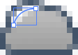
Ok, that's a little unfair. Making precise bezier curves is tricky business (and that's a whole other tutorial). I did however create a quick little movie showing that exact curve being created: Cloud Highlights.mov. (When you see the cursor inverted in the movie, that means the mouse is pressed).
Here's the play by play:
1) Click and drag out your beginning point, moving the handle horizontally to the left. This will define the direction your curve will go out. Release the mouse when you are done. 2) Move the mouse (and notice how you'll get a little preview of the curve) down and to the left to where you want to end the highlight. 3) Double click to end the curve. 4) If you're not happy with the positioning, switch to the move tool (the 'v' key) and you can select individual points, and use the keyboard to move them around.
Piece of cake.
Next make the second highlight, which is down and to the right. To make it easier this time select the first highlight with the move tool, holding down the option key, and dragging away from it. This will make a copy of the first highlight. Adjust the endpoints of the curve to make it a little smaller.
And last, but not least- hit the '5' button on your keyboard. This is a shortcut to set the opacity of the current layer to 50%. If you hit '5' twice in rapid succession, the layer will turn to 55% opacity. Hit '3' and it'll turn to 30% opacity. You get the idea. (Since you don't have a 10 key, pressing '0' will change it to 100% opaque, which is the default for new layers).

And there's the final cloud. You can download the acorn file for this guy right here.
Now, just looking at these shapes on white backgrounds isn't all that impressive. Often times you'll want to put your icons in the environment they are going to eventually end up in to get a real feel for them. Since I just did these for fun, they aren't meant to end up anywhere specific. But, here's how you can add some background gradients or layer styles to liven things up a bit:

Use a radial gradient as the background.

Make a layer style with a red drop shadow to make it spooky.

Take all your hard work and make it pointless with a monotone layer style, but add a white drop shadow and a dark inner shadow layer style at the same time, to give it an embossed look.

Or just let them be.