I recently had need of a popover for so I whipped one up in Acorn using the vector tools:
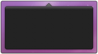
Download: popover.acorn
It's made up of 3 layers (though I guess it really only needs to be one). The bottom layer is just two flat black shapes (a rectangle with rounded corners, and a rotated square):
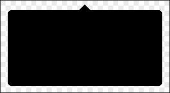
The next layer on top of that is pretty much the same, just inset by a pixel on the sides and shorter so it doesn't poke out the bottom.
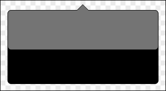
This second layer is how we get the little highlight on the top of the popover:
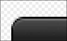
And then finally, we've got the top layer which is the gradient. This layer's box is also inset by a pixel on either size from the bottom layer, but it's also one pixel shorter on top from the highlight layer. That's so the highlight has room to poke out on top.
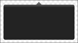
You'll notice that gradient moves smoothly across both shapes. You can do this by selecting multiple shapes in Acorn, and then applying the gradient across them. And once again, it's scalable as well. Here it is at 2x:

