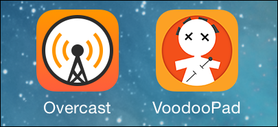
VoodooPad for iOS was recently updated, and shipped with a new icon.
I like this icon.
Probably because I made it right after iOS 7 went into beta. I was digging the new design language out of Apple, and whipped this guy up for the 2.0 that I never shipped. I'm pretty happy Plausible Labs ended up using it.
When I first saw Marco's icon for Overcast, my heart sunk a little. Here was a nice looking icon, that used very similar colors as VoodooPad's. But only a couple of people had seen VoodooPad's icon and I just knew that a small number folks would look at it and assume I ripped off Overcast. But this post will hopefully head that off. Possibly.
I think they are both great designs, and they were created independent of each other.
VoodooPad's is better though, if a bit dated at this point. It's classic.