
I was working on a bug in Acorn yesterday with the Curves filter, and I noticed that when pushing the green channel to extremes that it became pretty blown out. While first looking at the filtered image I thought the results might be right… but maybe it wasn't? So I threw a mental note in the back of my head to compare what Curves in Acorn is doing versus Photos and Photoshop.
And then when was I knee deep in actually fixing the original bug, I realized there was a better way of creating the LUT (lookup table) from the curves data and that idea just kind of stuck in my head as well.
So after fixing some last minute sandboxing issues for Acorn 6.3 today (it's always the sandbox!) and submitting it to Apple, I decided to look into these two curves things.
Turns out that my idea for creating the LUT also fixed the blown out colors bug.
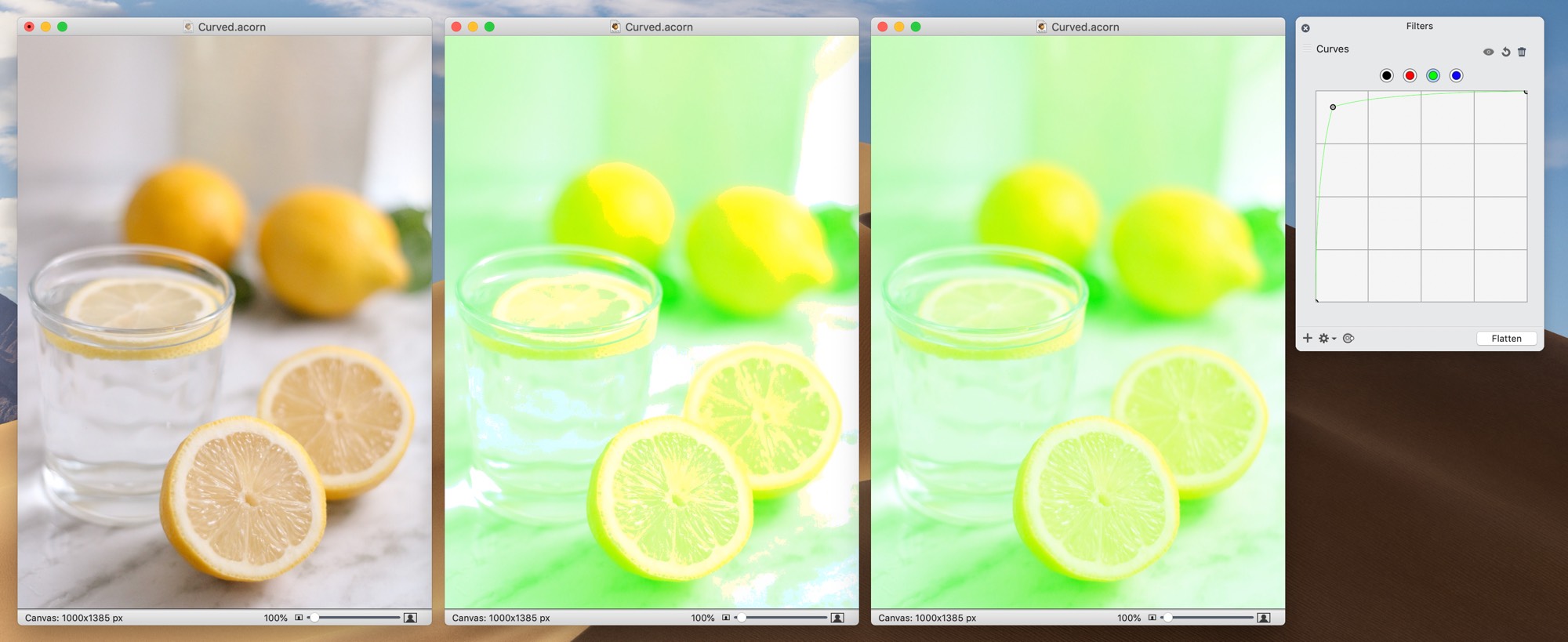
(click to embiggen)
The left window in this screenshot is the original image. The middle image is what is shipping in Acorn 6.3 and earlier. And finally we have the fixed version (aka, Acorn 6.3.1, which hasn't left my Mac yet). You can see the whites and the yellows not mixing very well when compared to the fixed version. And finally the filter window on the right is what the green channel was set to, so you can see how much I was pushing it.
It's always delightful when things come together like this.